You know it, your friends know it, your cat knows it - even your boss has an inkling: mobile is the browsing portal of choice, and it demands a re-think of the way we approach search optimisation. Developments for mobile browsing are coming thick and fast, and digital marketers have to run to keep up; these are our top tips for the future of mobile SEO.
“AMPlify” your Site
Just over half of all users will abandon a page if it takes more than 3 seconds to load, which means that mobile sites need to be as streamlined as a greased dolphin - it doesn’t matter if you’re driving traffic from Google Ads - where a slow page load speed will affect your Quality Score and drive the cost of each click up, or Google’s organic results - where a slow "time-to-first-byte" will likely cause your site to rank lower down the page, probably not even on page 1.
Taken together, what this means is that you’ve got to be fast; real fast, and the Google backed Accelerated Mobile Pages (AMPs) project aims to provide that speed. Note that the Guardian and USA Today have both formatted their news articles using AMPs (look for the “AMP” and lightning bolt at the bottom of the link), which helps improve their user’s mobile experience.
AMPs create a mobile-first design philosophy by requiring developers to use a common technical core, and boost loading speeds by caching files in Google’s servers - the platform offers fewer tools for developers, but the opportunity to improve loading times is likely to see a big return on the time you invest. Google recently recommended a set of plugins for CMS systems like WordPress and Drupal, and provided a Codelab tutorial to help developers get started with AMPs.
In addition to this, they’ve also provided a list of tips for implementing AMPs, which outlines the benefits and limitations of AMPs. Google’s support of AMPs shows that they’re here to stay, so developers need to begin taking advantage of them when designing for their clients.
Snippets for Success
The limited space of a mobile screen means that the snippet (the “quick answer” displayed on top of the organic results) which users are presented with will often take up the majority of the screen, making this an important area of digital real estate; this position was dubbed the "#0 Rank" by Moz’s Dr. Pete.
Competition for this space is fierce, but by properly structuring your data through the use of Google’s Schema and Data Highlighter you can send a strong signal that your page contains relevant info, and show Google where to look for it. For example, marking up a set of instructions using the "ItemList" schema shows Google how the information should be displayed, and helps it to present it properly to users; you can use this to display recipe steps, sports rules or “Greatest Hits” lists, and Google will know how to order it.
Don’t forget that Google will attempt to cut out the middleman where possible (catchily known as “disintermediation”), answering queries through the Google Knowledge Graph instead of search results: for example, a search for conversions between miles and kilometers can be handled directly by Google, so there won’t be a #0 spot up for grabs. This means that you need to target detailed information such as recipes, how-to guides, reviews and definitions, which cannot be easily and definitively answered by Google alone.
We recently managed a pretty big win by securing one of these answer boxes for the law firm Porter Dodson, by carefully considering what questions people were asking Google and how best to answer them. Here’s how we did it:
- We asked the lawyers what questions they heard most during initial consultations with prospective clients.
- We cross-checked what they told us against search volumes that showed up in keyword research tools like Google Trends, Answer The Public and Google Keyword Planner.
- We looked at the relative difficulty for ranking for those keywords too - any query that would be typed into Google and had relevant results from highly trusted sites were of no use to us - we were looking for the gaps in the knowledge graph.
- Those keywords that had significant volume and had a fair chance of Porter Dodson being able to rank with an answer and also matched what real people asked their lawyer in that first meeting were our target questions.
- Before we started getting the blog posts written that would answer the target questions, we thought about the user. Would they type this query into Google? Would they be likely to use a voice search? Or would it be a mix of both?
- Finally the blog post was composed which answered the question with just enough detail in the opening paragraph to target that all important answer box.
- We used the question (as it would be typed or spoken into Google) as the blog headline.
- Using WordPress with the Yoast SEO plug-in enabled us to put the blog headline in all the important “traditional” on page SEO places; the URL, the Page Title, the H1 tag, the image alt text and, obviously, throughout the full piece of content.
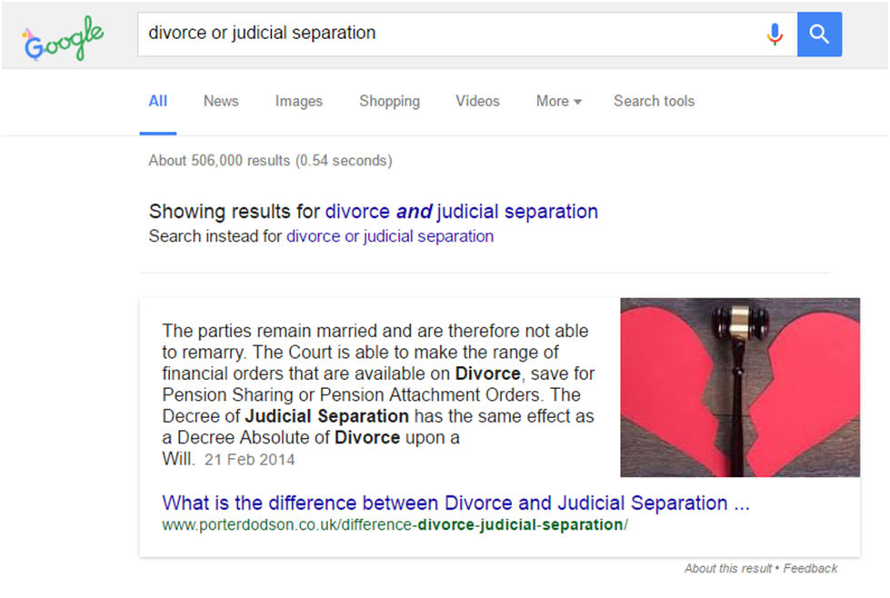
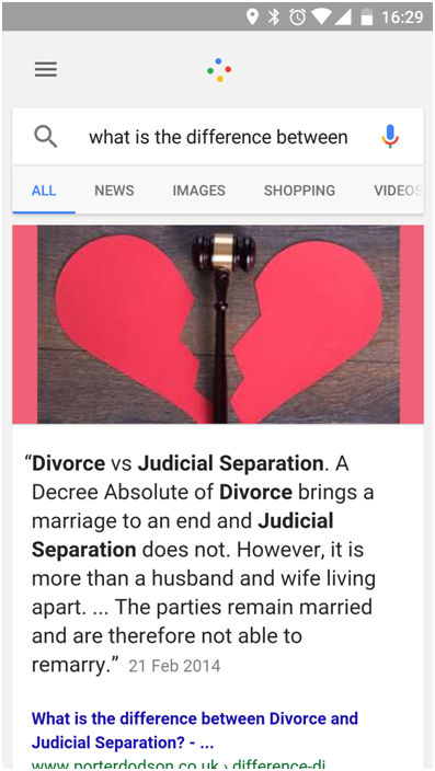
Here’s the results on Google...
That’s the answer box on Google but as you can see, the original article is a lot longer.
Crucially for us as SEOs, this Google results page shows NO GOOGLE ADS. This is a huge win - search for divorce and the whole top of the page is taken up with them on desktop and phone, but here, Porter Dodson dominate.
This is a really great way to improve a site’s rankings, as there is little SEO wizardry involved; simply identify a question which is being asked but not answered, and produce a well-written response that adheres to basic SEO best practises. This is a very effective approach, and it can put you at the top of the SERPs without forking out a fortune in PPC fees.
Capturing Voice Search
Voice search is growing, and quickly; Google’s Sundar Pichai revealed at the 2016 I/O developer conference that one in five queries through their Android app is a voice search, and research shows that the usage of voice-activated personal assistants has more than doubled since 2013. This means that developers have to create new strategies for capturing voice queries, which are typically phrased conversationally: “OK Google, I need to buy a cake for my Dad’s birthday”.
We took this into account when going after the snippet for Porter Dodson; people don’t just say "divorce and judicial separation" to their phone; they ask it “what is the difference between divorce and judicial separation?", an important distinction which we highlighted throughout the content. Which means when you ask your Android phone this, Google reads out the answer prefixing it with “According to some information I found on Porter Dodson’s Website… "
When identifying keywords (unless you’re a huge name brand), you’ll be best off targeting long-tail, detailed key phrases - these will become more important, as they start to feature more heavily in voice searches. Don’t get carried away, though; voice search may be growing exponentially, but it’s unlikely to replace typed search (which is also growing, albeit at a slower pace) anytime soon.
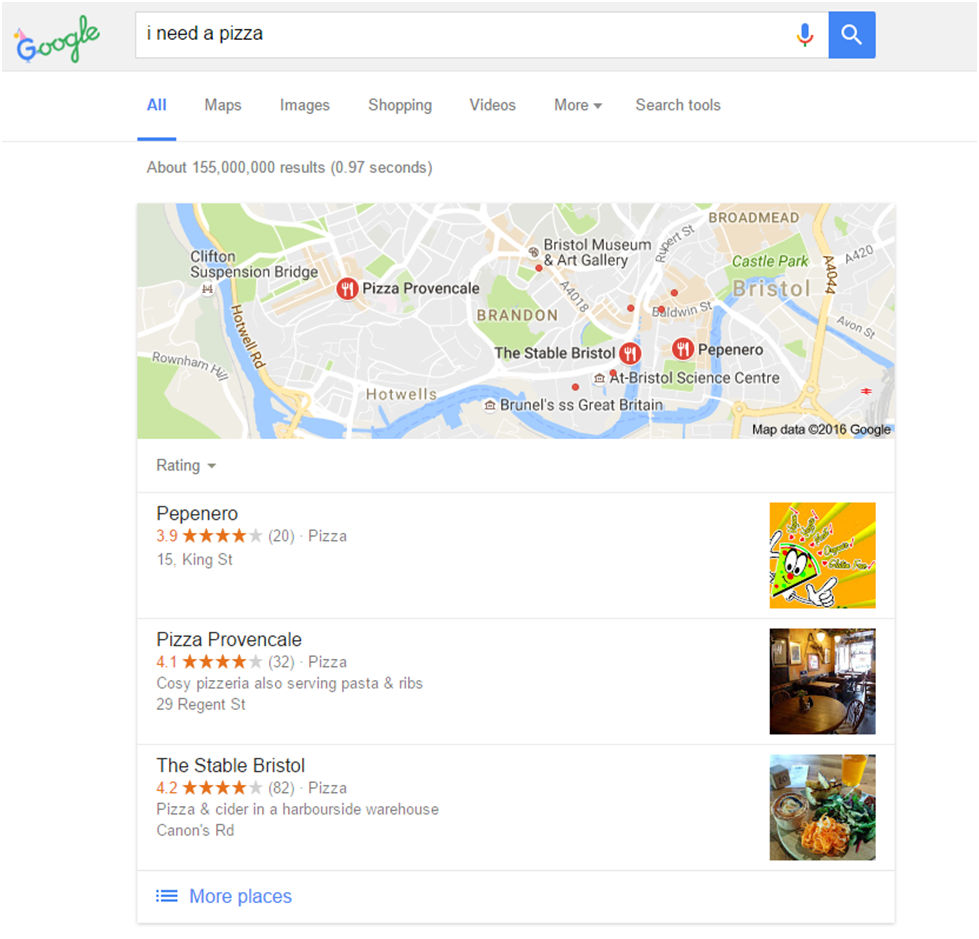
Voice searches have been shown to have strong local intent, and a high conversion rate for local businesses; users search for specific services, often phrasing their queries as a request for action; “Hey Siri, order me an extra-large Hawaiian Special with a stuffed crust”. That’s why it’s important to ensure that your site is properly optimised to capture local searches, because they have a high value for your business.
The Money’s in Mobile
It still surprises me how many brands think that if they have a responsive website (or maybe a mobile version), they’re doing OK in 2016. You are not doing OK with a website that responds well to a mobile user’s device. You are doing just enough and you are about to get left behind. Why? Because those of us with an eye on the climbing numbers of mobile visitors to websites of all types have been designing for mobile first for over a year or two.
“Mobile first” differs from traditional web design because you lay out all the wireframes, flat visuals and prototype in mobile format first and then figure out how it should convert to give the users on a desktop or laptop a decent experience too. Why? Because the traffic to many websites (and particularly B2C) is mainly now from people on mobiles.
We recently worked with a retailer who had been refusing to confront the issue of having more visitors from mobile devices than from desktop, even though they converted less of their mobile visitors to customers.
They trotted out all the standard lines; “Oh, people don’t trust websites enough to buy on mobile”, “People might look on mobiles, but they prefer to buy on desktop - just look at how much higher the conversion rate is on desktop!” and “Oh god, oh god, oh god… if we change, we’re going to have to update our dinosaur of a Content Management System” but these old lines were sounding more and more hollow, so they found themselves in a room with me and the rest of the Noisy Little Monkey troop.
We inflicted many meetings, some tears, a bout of food poisoning, a full year of hard coding, and finally their new “mobile first” website went live.
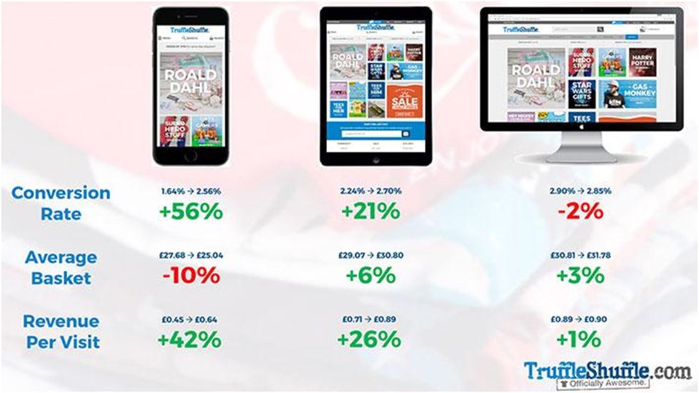
We were thrilled to see that Truffle Shuffle saw a 23% increase in their Revenue Per Visit almost overnight. The Conversion Rate for mobile visitors is up 56%.
These are exciting times in the world of digital marketing, as mobile technology is providing amazing opportunities for brands to better engage with their customers. Properly optimising your websites to take advantage of these developments will position you at the head of the pack in 2017, so start working on these updates now!
About the author
Jon Payne is the founder and Technical Director of Bristol Inbound Marketing agency, Noisy Little Monkey, who make profitable websites but sometimes poison their best clients. You can find them on Facebook and on Twitter.
- Log in to post comments


