

The new recent desktop redesign has had a mixed reception. Some power users are unhappy about lost features whilst many everyday users have welcomed the simpler mobile-like menu. Whether you love it or loathe it, there are a number of changes to design and functionality which will impact how you use LinkedIn.
One of the main changes you will notice is that in many sections you now must click on an item to open it fully. This makes for a simpler and cleaner design but it also has implications for how you present the information on your profile.
In this article, I will highlight the most important changes and how you can use them to your advantage.
Custom Image
The dimensions of the optional custom image have changed, it is now a little smaller. If you already have a custom image on your profile page you may be able to reposition it so it still works or you may have to replace it.

Fig 1: The Custom Image dimensions are now 1536x768
If you want to add a more sophisticated background photo with text for example, this site has some pre-built templates.
Summary Field
In the new design the summary has been moved right to the top of your profile but only the first two lines show. In fact, between 200-230 characters show, it depends on character width. On mobile only 60 characters will show. Think very carefully therefore about what you put in these first two lines. Here is an example from Sean Parker’s profile:

Fig 2: Only the beginning of your summary now shows on the desktop and mobile
Articles and Activity
The next section on the profile page highlights your most recent activity on LinkedIn.
If you publish articles on LinkedIn, then your latest article will be shown plus your last three activities. If you haven’t published any articles your last six interactions will be shown.
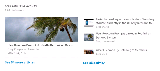
Fig 3: Your activities show more prominently
Two things to point out here. One, if you have something valuable to share, writing articles on LinkedIn is a good investment. They are very visible addition to your profile and help to position you as an expert in your niche. Two, be careful what you like, comment and share because your LinkedIn activity is now featured much more prominently on your profile, as above. If you are regularly interacting with “trivial” or non-professional posts that doesn’t look good.
Experience Field
Your latest position and only your latest position is displayed in full on your profile. It is therefore very important that this section is completed fully. If you have more than one current position you can change the order of which one is displayed but you can’t change the order of previous positions.
If someone viewing your profile pages down, they will miss your summary and focus on the experience section. It should therefore work as a stand-alone introduction. Just as for the summary section there is a maximum of 2,000 characters. Don’t forget you can also add images, documents and presentations to this section as well as the summary section. Here is a list of formats that are supported.
Note: new work experience positions are added from the side panel “Add new profile section”.
Skills and Endorsements
You can list up to 50 skills. In the previous version, the top ten most endorsed skills were featured with thumbnail pictures of the endorses as below:
In the new version, ONLY the top three are featured, and only one endorser thumbnail is shown.
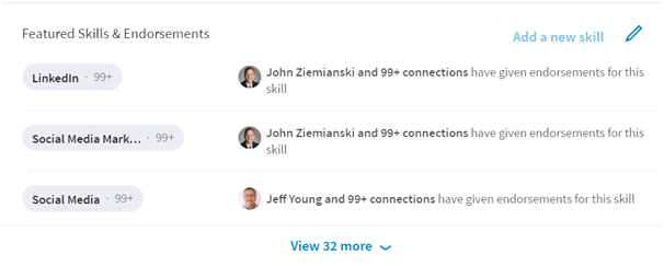
Fig 4: The new endorsements section
It has always been possible to reorder skills so that the most important ones are highlighted on your profile. Now that only three skills are visible it is even more important to do this.
Note: In the new design, the recommendation feature has also been simplified and all recommendations are collated into one section i.e. not posted against a position. Unfortunately, it is no longer possible to reorder recommendations so you can no longer move the best ones to the top.
Search
The search feature has been completely redesigned. The original search based on text boxes has been replaced with a less intuitive one based on search operators. The underlying mechanics are different. Don’t worry too much about the technicalities. It’s a bit like moving from a manual car gear change to an automatic one. It will be fine once you get used to it.
To start a search now click on the magnifying glass in the search box. Type in the word or phrase you are looking for. There are then 7 filters along the top pf the page which you can use to refine your search including people, company, and groups.
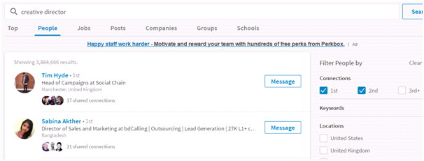
Fig 5: The new LinkedIn search
In addition, on the right-hand side you can further refine the result by:
- Relationship i.e. 1st, 2nd or 3rd+ degree connections
- Keywords (first and last name, title, company, school)
- Location
- Current or past company
- Industry
- Profile language
- Non-profit interests
- Schools (College or University)
That is some impressive search power and what’s more it is available on all free accounts.
Conclusion
I ran an in-house course for a media company recently. One of the people on the course had never used LinkedIn at all but they quickly felt comfortable with the new design. I guess that will be music to LinkedIn’s ears. The easier it is to use the more people use the platform.
For established users, it will take a little while to get used to finding things in different places, but not too long. Social media platforms, including LinkedIn, are constantly changing. The essential point here is by keeping up to date with the changes on LinkedIn and making a few adjustments to how you use it, you will maintain a competitive edge.
- Log in to post comments